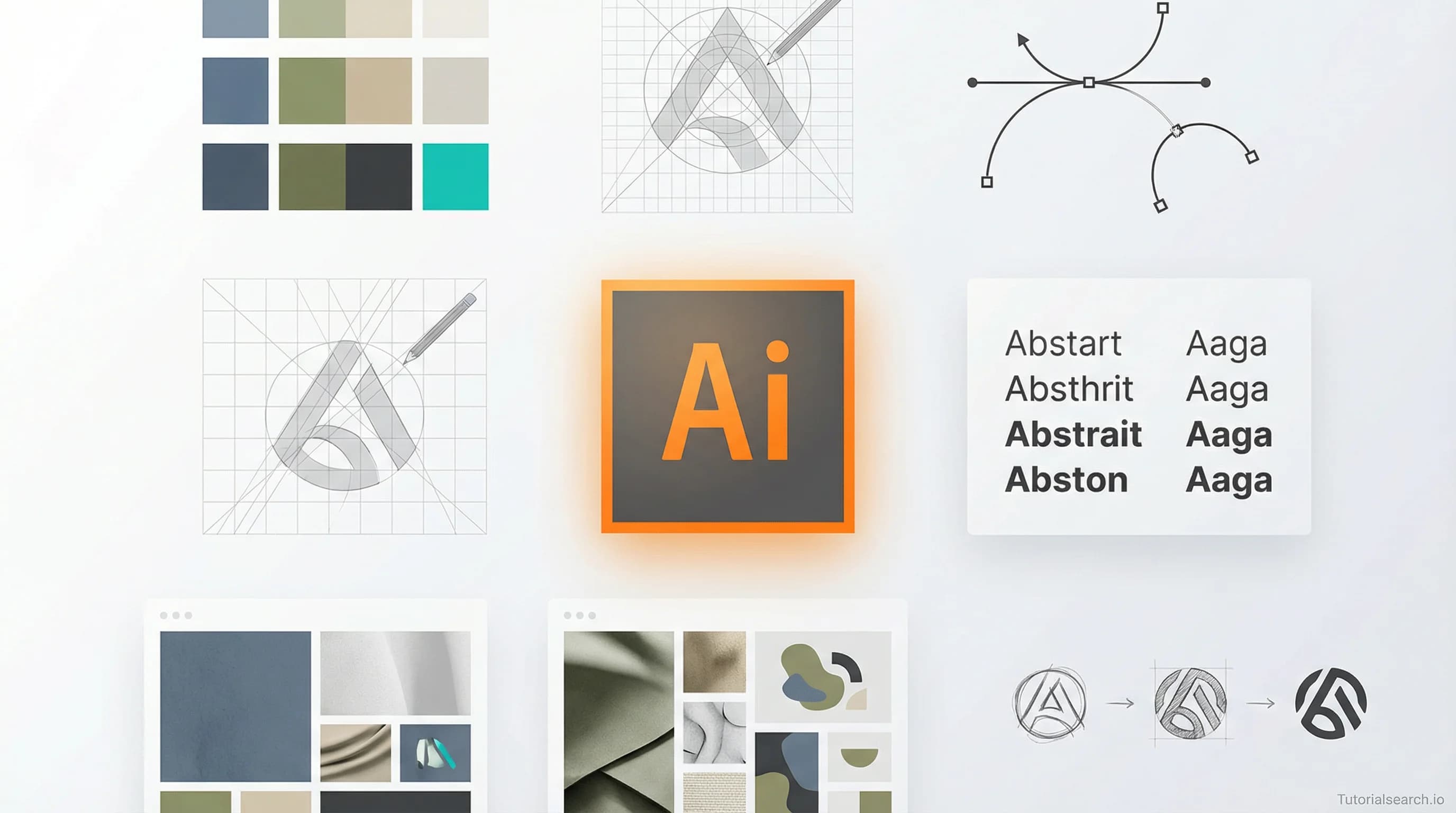
Logo Design Mastery: Build Brands That Actually Stick
Master logo design fundamentals—from strategic thinking to portfolio building. Discover how professional designers choose tools, develop client processes, and create logos that actually stick.
Hire the developers behind TutorialSearch.io
We built this site — full-stack web apps, AI integration & automation. Tell us what you need and we'll build yours.
Logo design success has almost nothing to do with being a "natural artist" and everything to do with understanding visual communication principles, picking the right tools, and building a process that clients trust.
Most beginners believe they need five years of art school before designing their first logo. That's false. What they actually need is clarity on three things: how to think visually, which software matches their workflow, and how to deliver work that solves real business problems.
Key Takeaways
- Logo design is a communication discipline, not an art form. Your job is solving visual problems, not creating beautiful objects. The best logos are simple, memorable, and aligned with business goals.
- Professional tools don't make professional designers. Expensive software like Adobe Illustrator is optional. Affinity Designer, Figma, and even free vector tools can produce world-class results.
- Portfolios beat portfolios with flashy presentation. Case studies showing your process (research, sketches, iterations, rationale) outperform galleries of finished logos with no context.
- Typography and spacing are 80% of logo design. Most beginners obsess over "perfect" curves and complex imagery. The real craft happens in font pairing and pixel-perfect alignment.
- The minimalism trend is overrated. Simple doesn't mean empty. The best logos of 2026 blend minimalism with distinctive personality through unexpected color choices and thoughtful details.
- Client communication is harder than the design itself. Learning to ask the right questions, manage expectations, and defend your work through iterations is more valuable than mastering a particular design tool.
Table of Contents
- The Three Pillars of Logo Design
- Choosing Your Design Toolkit
- Logo Design Fundamentals: Beyond the Basics
- Building a Logo Design Process That Clients Trust
- Portfolio Strategy for Logo Designers
- Advanced Logo Design Techniques
- Real-World Logo Design Scenarios
- Frequently Asked Questions
The Three Pillars of Logo Design {#three-pillars}
Every professional logo design project rests on three foundational elements: research, visual strategy, and technical execution. Skip any one of them and your work will feel amateur, no matter how technically polished.
Pillar One: Strategic Research. Before opening design software, you need to understand the business, industry, target audience, and competitive landscape. What does the company actually do? Who are they trying to reach? What do competitors visual identities look like? This phase takes 30-40% of your total project time and directly determines whether your design solves the right problem.
Pillar Two: Visual Strategy. This means deciding what visual language your logo should speak. Should it feel traditional or contemporary? Playful or serious? Are you using abstract symbols, letterforms, or pictorial marks? The best designers document this strategy before sketching. It becomes your north star when you're making detailed decisions about spacing, color, and typography.
Pillar Three: Technical Execution. Once you've nailed the concept and strategy, technical work is relatively straightforward. It's about creating clean vector files, managing colors, ensuring legibility at small sizes, and preparing deliverables in multiple formats.
Most beginner courses reverse this order—they start with software tutorials. That's backwards. Learn to think strategically first. The software becomes easy once you know what you're trying to communicate.
Choosing Your Design Toolkit {#choosing-toolkit}
[Editors' Choice] The software wars are mostly irrelevant. Your toolkit should match three criteria: your learning style, your budget, and your production workflow. Some designers love Adobe's ecosystem. Others swear by Affinity Designer's simplicity. Open-source enthusiasts prefer Inkscape. The differences matter far less than consistency and mastery.
Start with Figma's free tier or Affinity Designer's free trial. Spend 40 hours using whichever feels natural. Then commit to that tool for the next 100 projects. Consistency beats optimization.
Logo Design Fundamentals: Beyond the Basics {#design-fundamentals}
Most beginner tutorials teach software mechanics. Useful, but incomplete. Real logo design fundamentals are about visual communication principles that work across any tool.
Typography as Logo Design
[Editors' Choice] The most underrated skill in logo design is typography. 40% of successful logos are primarily typographic—the wordmark is the logo. Think IBM, Coca-Cola, FedEx, Google, Netflix. The type choice, letter spacing, and proportion refinements matter more than any illustrative element.
For wordmark logos, start here: Select 2-3 typefaces maximum. Mixing four fonts is visual noise. Usually you'll pick one primary font (often modified) and one supporting font for secondary lockups. The best approach is choosing a typeface with good character because bold, expressive type is easier to build a brand around than generic sans-serif number 47.
Kerning (letter spacing) is the detail that separates amateur work from professional. Most design software has auto-kerning, but manual refinement is where the craft happens. Spend time visually adjusting space between letter pairs. The goal is consistent visual rhythm, not mathematical equality.
Building a Logo Design Process That Clients Trust {#client-process}
Hire the developers behind TutorialSearch.io
We built this site — full-stack web apps, AI integration & automation. Tell us what you need and we'll build yours.
The difference between freelance designers who charge $500 per logo and those who charge $5000 isn't the quality of the final file. It's the process and client communication.
Discovery Phase
Start every project with 10-15 targeted questions. Not generic "tell me about your business" questions. Specific questions that reveal visual strategy.
Answers to these questions should drive 70% of your design direction. Most beginners skip this and wonder why clients reject work. You're not making a logo—you're translating a business strategy into visual form.
Sketch Phase
Yes, sketch on paper first. Even if you're not "good at drawing." Sketching externally explores ideas faster than jumping into software. Aim for 30-50 rough sketches exploring different concepts, wordmark variations, symbol approaches, and compositional ideas.
Photograph or scan your best sketches. Share 3-5 directions with your client. Don't show 20 options—it creates decision paralysis. Frame each direction with your strategic reasoning.
Get feedback on directions, not polished designs. This saves enormous time and ensures alignment before detailed vector work.
Refinement Phase
Pick 1-2 winning directions. Develop them in your design software. Test at multiple sizes. Refine spacing, proportions, and details. This phase is often 30-40 iterations that are invisible to the client—spacing tweaks, subtle curve refinements, color exploration.
Presentation and Revision
Present your final concepts in a professional deck showing context mockups (business cards, website headers, signage, vehicles). Show the logo in multiple sizes, colors, and applications. Include your design rationale.
Include 2-3 rounds of revision in your proposal. After that, additional changes are billable. This prevents endless tweaking and respects your time investment.
Delivery
Deliver comprehensive file packages: master vector file (EPS or AI), single-color versions, horizontal and vertical lockups, minimum size specifications, color specifications (Pantone, RGB, HEX), spacing guidelines, and do's/don'ts. Create a brief brand guide document. Professionalism at this stage justifies higher rates and builds client confidence.
Portfolio Strategy for Logo Designers {#portfolio-strategy}
[Editors' Choice] Your portfolio is the most important marketing tool you have. Most designers fill portfolios with finished logos without context. Wrong approach.
Strong logo design portfolios show the process and thinking, not just the final result. For each project, include: the brief, research and strategy, sketching phase, development, final result, and a case study write-up.
Case studies beat portfolios every time. They demonstrate your thinking process. Clients hire designers who think strategically, not designers with pretty portfolios.
Build this portfolio in Behance, your own website, or even a simple PDF. Keep it focused—12-15 case studies maximum. Quantity confuses potential clients. Depth impresses them.
Advanced Logo Design Techniques {#advanced-techniques}
Once you've mastered fundamentals, these advanced approaches separate good designers from great ones.
Negative Space Integration
Using negative space as a design element is a hallmark of sophisticated logo design. The FedEx logo is famous for its hidden arrow. The WWF panda uses negative space to create form. This isn't gimmickry when done well—it's layered communication.
Negative space works best when it feels inevitable, not forced. The technique is: After designing your primary form, look at the empty space it creates. Can you suggest an additional meaning or shape through that negative space without compromising the primary design?
Geometric Construction
[Editors' Choice] The most timeless logos use geometric grids. Instead of drawing freehand curves, many professional designers construct shapes on a grid. This creates consistency, proportion harmony, and mathematical elegance.
Create an invisible grid (circle, square, or custom modules). Build your letterforms and symbols within that grid. This constraint forces discipline and often yields more refined work than freehand drawing.
Real-World Logo Design Scenarios {#real-world-scenarios}
Scenario 1: The Startup Budget is $800
You have 20 hours to deliver a logo. Start with strategic questions (4 hours). Sketch extensively (4 hours). Develop 3 strong concepts (8 hours). Present, revise based on feedback (4 hours). Deliver.
Don't offer unlimited revisions. Scope is your protection. The client gets 2 rounds of revision included. Further changes are $150/round.
Scenario 2: The Client Wants "Something Like the Apple Logo"
This is a test of your strategic communication. You need to understand why they admire Apple's logo (minimalism? elegance? recognition?), then translate that inspiration into an original direction that actually fits their business.
Show them that copying Apple's approach doesn't work for their business. Apple's minimalism works for Apple because they have unlimited marketing budget to build recognition. A new company needs distinctiveness more than minimalism.
Frequently Asked Questions {#faq}
Q: How long should logo design take?
A: Minimum 40 hours for serious work. Most professionals charge $2000-$5000 because that's what 40+ hours at professional rates costs.
Q: Should I learn Adobe Illustrator first, or can I use Figma?
A: Learn whichever appeals to your workflow. Figma is easier to start with, Illustrator has deeper vector tools. Neither is "better"—they're different.
Q: How many concepts should I present to clients?
A: Present 3-5 distinct directions at sketch phase. Don't present 15 variations of the same concept. Each direction should represent different strategic thinking.
Q: Can I design logos on an iPad?
A: Yes. Tools like Procreate Dreams work beautifully for logo design, especially if you prefer hand-drawn elements.
Q: How do I charge for logo design?
A: Charge by project scope, not hourly. A simple wordmark redesign might be $1500-$2500. A complete identity system with logo, color palette, and guidelines might be $5000-$15000.
Q: What makes a logo timeless?
A: Simplicity, distinctiveness, and alignment with business essence. Logos using trendy effects age quickly. Logos solving genuine visual communication problems remain effective.
Q: How do I handle client rejection of my work?
A: First, ask specifically what they dislike. If it's vague ("I'm just not feeling it"), you're back to discovery—they didn't clearly communicate their needs. Second, remember that client taste is not design knowledge.
Logo design is a learnable skill. Software proficiency comes naturally after practice. What takes years to develop is the judgment to know when your work solves the communication problem, and the strategic thinking to know what problem you're solving in the first place.